
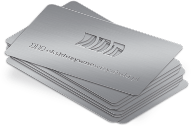
Matte Black Metal Business Cards: Why Everyone’s Obsessed
Ever gotten your hands on a matte black metal business card? If not, you’re missing out they’re the talk of the town for a reason! These cards scream premium and instantly make you look like you mean business. No glare, no smudgy fingerprints just a smooth, satin finish that feels amazing and gets people curious. And the best part? That minimal, highcontrast look makes your details pop. It’s simple, memorable, and sets you apart the second you hand one over.
What Do Matte Black Metal Cards Say About You?
So, why do people love these cards so much? Here’s what they really say about your brand:
You’re bold. Matte black metal isn’t shy. It stands out in a sea of boring paper and plastic.
You know quality. The material and weight instantly feel premium people literally remember you better because of it.
You’re modern and sophisticated. The finish and minimalist design say you care about the details, but don’t need to show off. For even more personalized impact, take a look at the range of metal card finishes available.
You value experience. These cards are all about intentional design no gimmicks, just something that feels great and looks even better.
Basically, if you want people to see you as credible, confident, and a little bit exclusive, these cards do a lot of talking for you.
The Secret Sauce: SatinSmooth, Durable Finishes
Ever noticed how some cards just feel better? That’s no accident! Here’s what goes into that perfect matte finish:
Step 1: Start with a sturdy metal base no flimsiness here.
Step 2: Through a multistep process, the card gets its smooth, lowglare surface (which also keeps fingerprints at bay).
Step 3: A protective layer keeps the card looking sharp, even after lots of handling.
Manufacturers tweak the coating and press settings to make sure every batch feels consistently awesome never sticky or too rough. Customers love it, and it keeps your info legible for the long haul.
Designing Bold, EasytoRead Typography
Let’s talk design. You want your info to stand out, but not in a shouty way. Here’s how to nail bold typography on metal:
High contrast: Think light text on a dark background easy to read, even in weird lighting.
Clean fonts: Go for sansserifs or geometric fonts. They’re crisp and clear at businesscard sizes.
Spacing matters: A bit of extra space between letters helps everything breathe.
Hierarchy: Make your name and role big and bold. Keep the rest clean and simple.
And remember, satin textures can change how things look so always check your design under different lights.
Mixing Textures & Minimalist Branding for Maximum Impact
You don’t have to go overboard to stand out. In fact, less really is more:
Subtle textures add depth and guide attention without making things busy.
Edge bevels feel great in hand and show off craftsmanship.
Satin embossing gives a hint of shine, but never looks flashy.
Laser etching keeps text and icons sharp even after being passed around.
Stick to minimalist branding: simple logo, clean lines, and let the textures do the talking. Studies show people remember cards with subtle contrasts much more than ones with overthetop designs.
Making a Memorable Impression at Events
Picture this: you’re at a busy event, and everyone’s handing out the same flimsy cards. You whip out a matte black metal card, and instantly, people take notice.
Immediate wowfactor: The look and feel are unforgettable.
Durability: Your card won’t get bent, smudged, or lost in the shuffle.
Tactile experience: The satin finish and textures invite people to keep touching and remembering you.
Pro tip: Pair your card with a quick, memorable oneliner about what you do. Let the card and your pitch work together to seal the deal.
Bottom line? Matte black metal business cards aren’t just cool they’re a statement. If you want to boost your brand’s credibility and stick in people’s minds, there’s really nothing else like them. Ready to upgrade your first impression?